Trove Foraging App

Overview
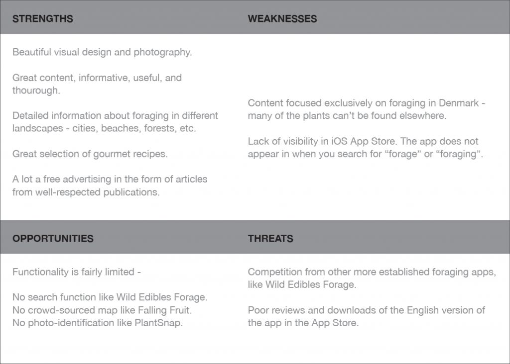
The current foraging apps on the market have a list of edible plants with information about where and when to find them, identifying characteristics, and poisonous look-alikes. The catch-22 for novice foragers is that if they don’t know the name of a plant, they can’t look it up. People can be overwhelmed by the sheer amount of information. If they see something in the wild that they think might be edible, they have no easy way of identifying what it is on the spot.
Problem Statement
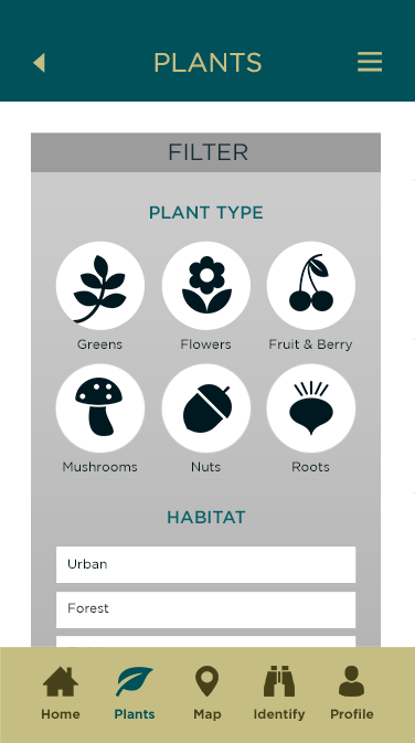
Our foraging app users need a way to filter plants by geographic location and season, identify edible plants on the go, and save their discovery to a map because they need to be able to safely find and identify edible food in their environment. We will know this to be true when we see positive reviews, customer retention and increased market share.
Hypothesis
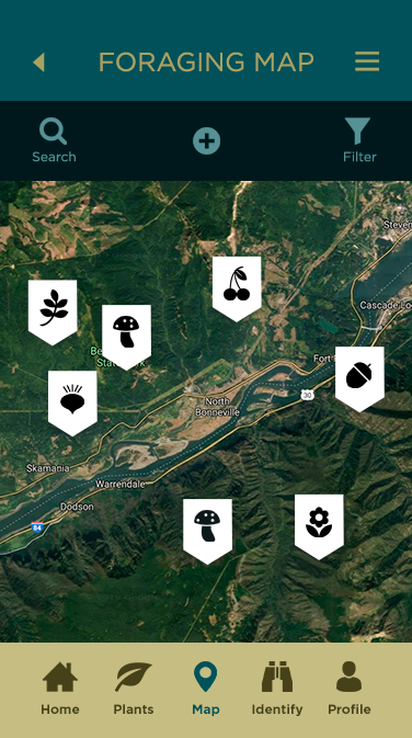
A crowd-sourced map of nearby foraging locations, as well as a system for narrowing down the identification of edible plants, filtering plants by geographical region and season, and identifying any plant instantly, simply by taking a photo.

User Research
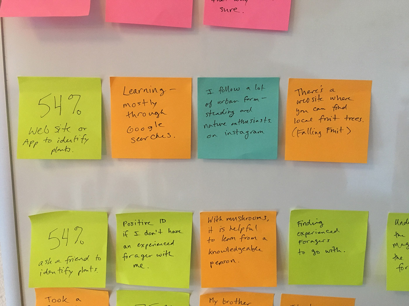
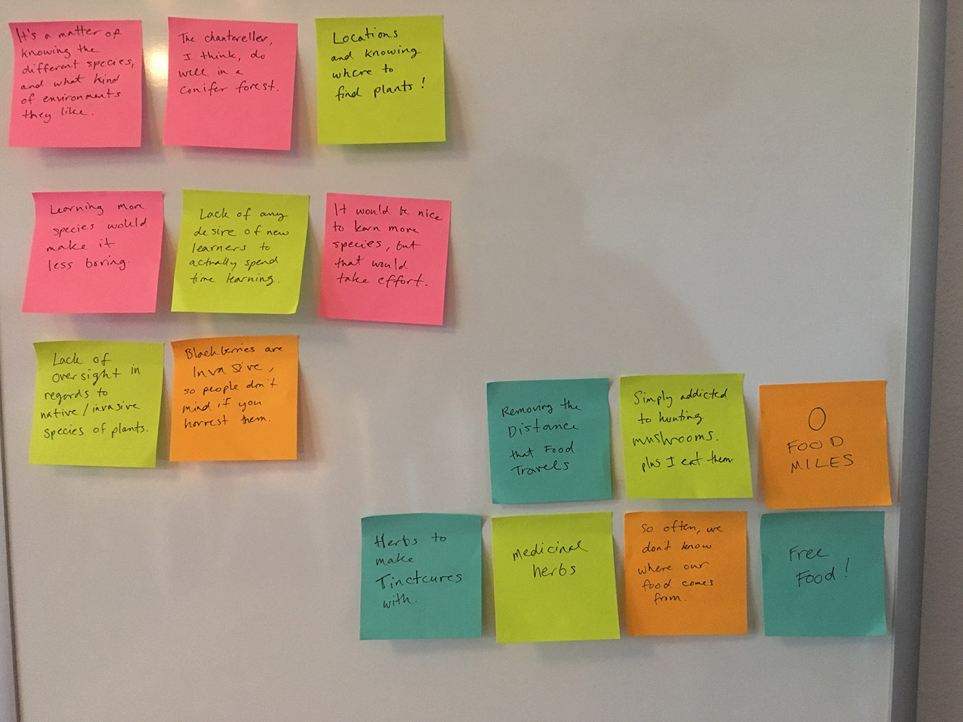
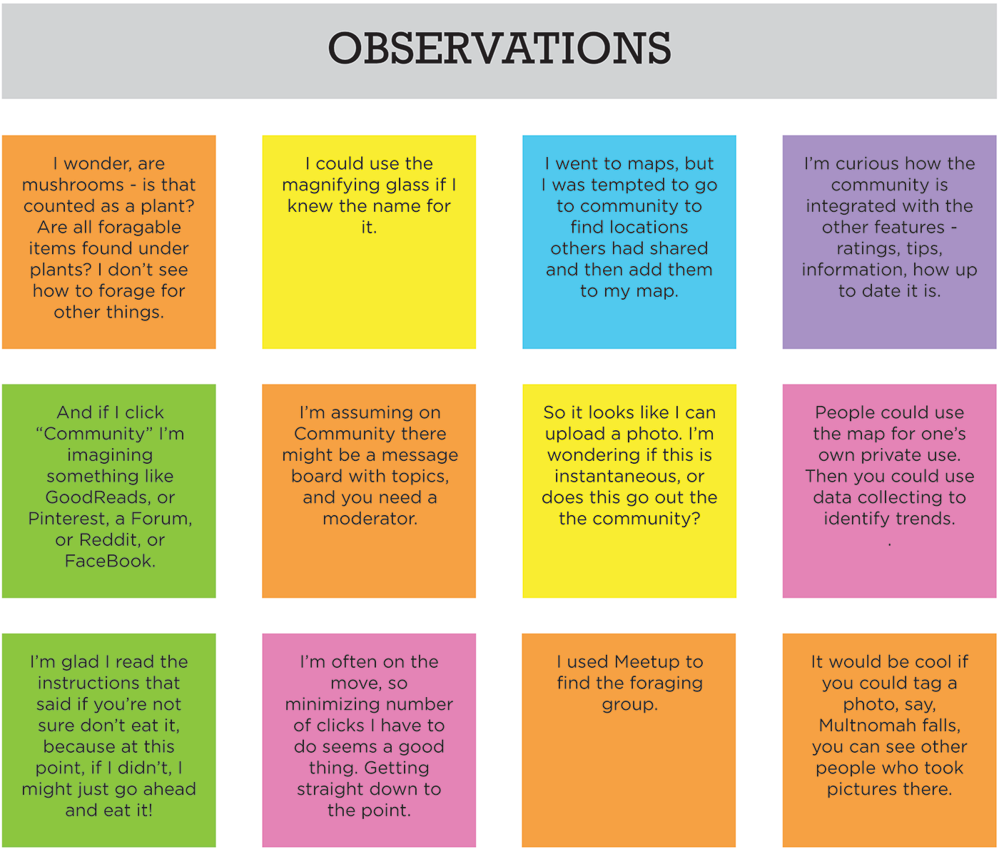
In order to learn more about the needs and challenges of the potential users of my foraging app, I conducted a series of 3 user interviews and a survey of 24 members of Facebook foraging groups. After testing I created a series of affinity maps and a rainbow spreadsheet to look for patterns in the data.
Findings
Currently, people use multiple different sources of information to learn how to forage and to help identify an unknown plant.
Many are frustrated with conflicting information sources.
Even experienced foragers are concerned about the risk of making a mistake.
Foragers of all experience levels seem to stick to only the species they already know.
Finding good locations is a huge issue for most foragers.
Novices want to connect with more experienced foragers.
Insights
Foragers are in need of a trusted source of information.
By providing a database of local edible plants, foragers can continue their education and branch out from the species they currently look for.
Although people will probably continue to use multiple methods to verify the identification of a plant, our app can be one of the few that can be used in the field.
The crowd-sourced foraging map feature can help people find successful locations,and share them with others, which the majority are happy to do.
I now think a community component would be a helpful feature – a way for foragers to connect with others nearby.
Also due to concerns I hadn’t thought of, like legal issues and over harvesting, it would be good to address responsible foraging in the app content.
Personas
Next I developed some user personas informed by my research. Experience level seemed to be a defining characteristic, so I created one novice, one intermediate, and one advanced forager to speak to these different user groups. These personas serve to establish empathy with the real people they represent, and also serve as a way to quickly communicate research results.

User Journey Map
Using my personas as a starting point, I created user journey maps.

User Flows
I then completed a task analysis and created user flows for each persona.

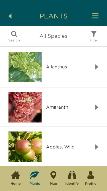
Site Map
Next I started thinking about the information architecture. I created a preliminary sitemap, and then did a quick card sorting exercise to see if it made sense. Using that data I updated my sitemap to be more logical and intuitive.

Design
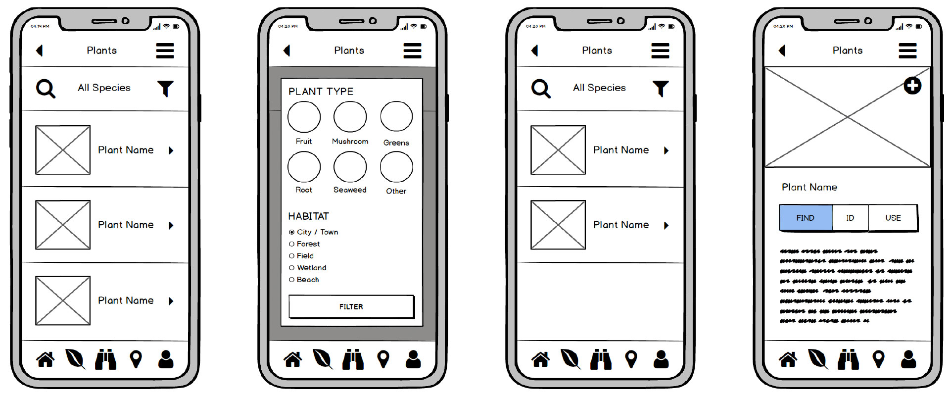
Low-Fidelity Wireframes
I kicked off the process with some rapid pen & paper sketching to generate ideas quickly.
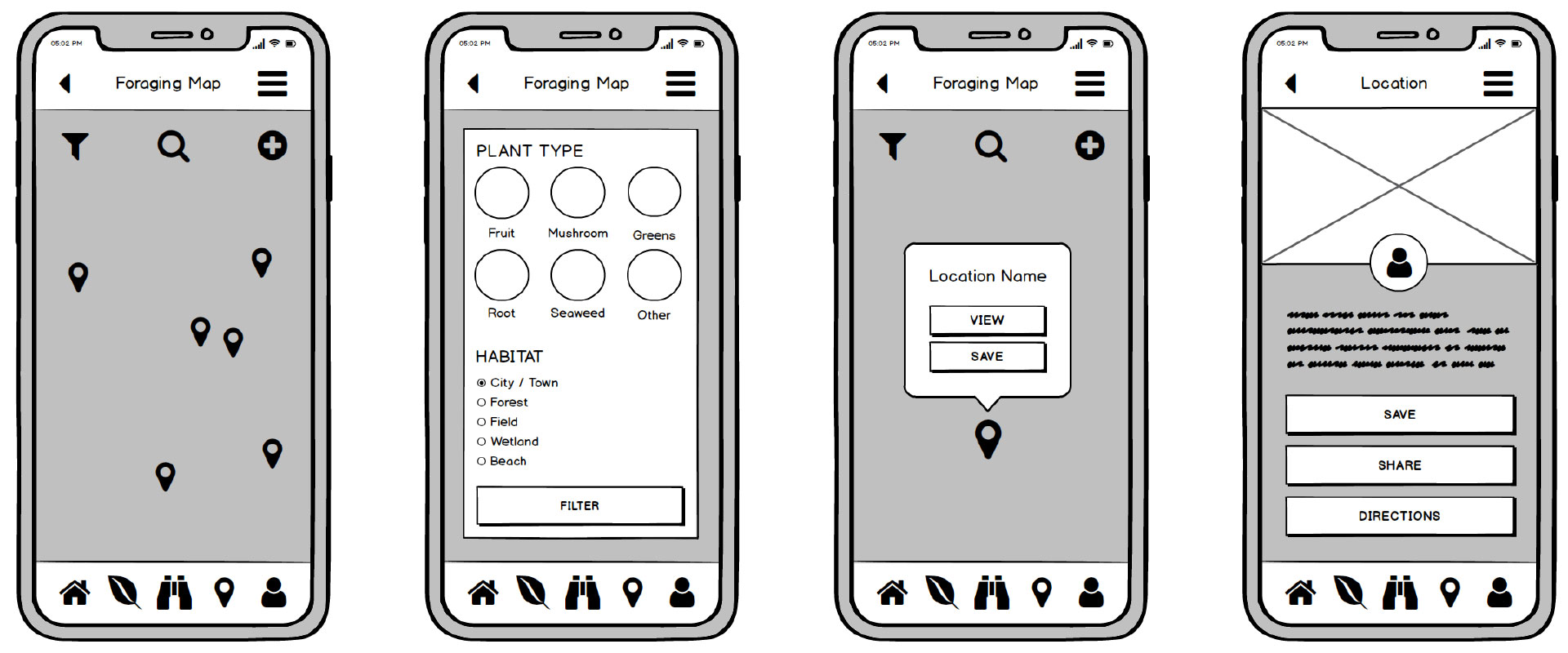
Mid-Fidelity Wireframes
Then I moved into mid-fidelity wirefames using Balsamic Mockups 3.
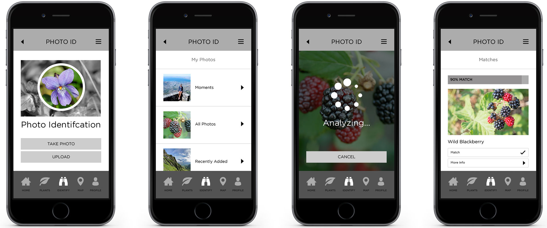
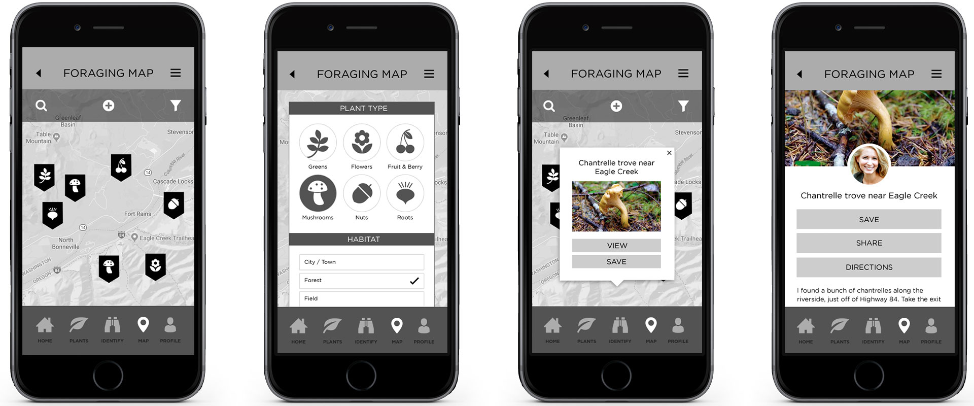
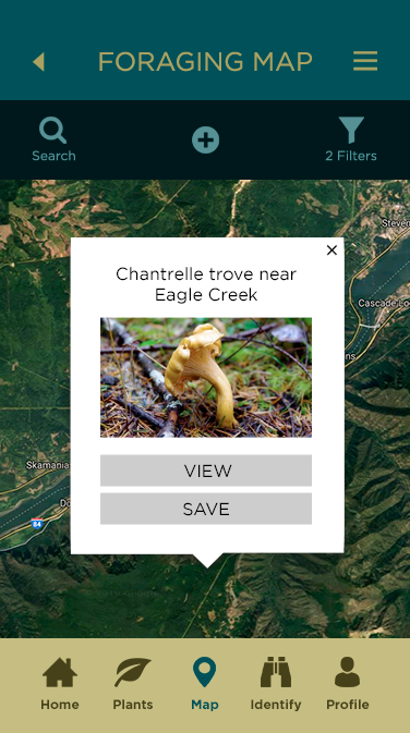
High-Fidelity Prototyping
At this point, I started thinking about design details such as layout, imagery, and typography. When I was satisfied with the overall layout and navigation, I created a high-fidelity prototype with InVision to prepare for user testing.
Testing
Usability Test
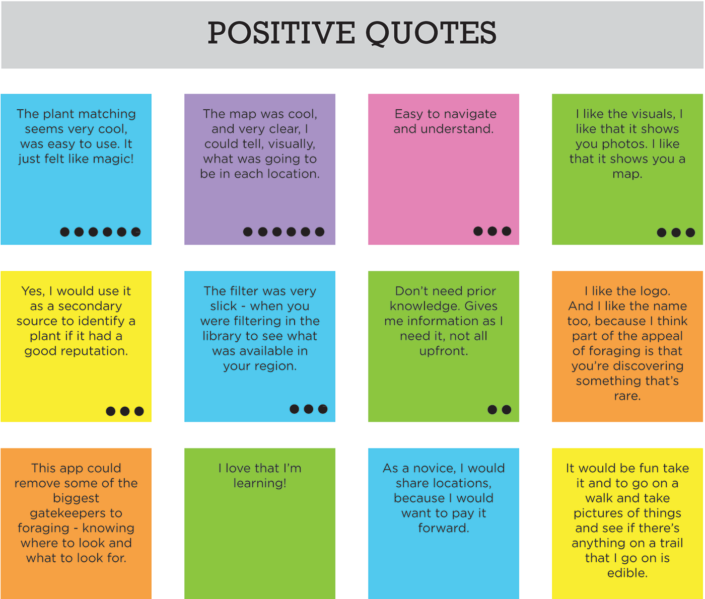
The usability tests were conducted as moderated in-person studies, in Portland, OR. The tests were peformed and recorded using an Apple iPhone SE. 6 participants were recruited and tested from January 27 – 31, 2019. The objective was to assess the learnability of navigation and core funcionality. The tasks were more or less completed successfully, but users did run into snags that slowed them down, especially in the on-boarding screens. In addition, many users wanted to see at a glance which plants had poisonous look-alikes. I considered that to be cruicial to fix, even though it didn’t interfere with anyone completing a task.
Preference Test
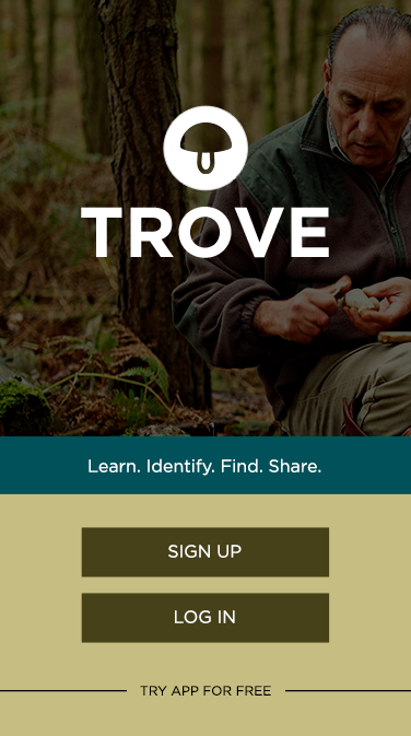
The on-boarding process was was the most problematic area for my users. They seemed confused by seeing screenshots of the app, so I used images and icons. I compared two different versions in a test on Usability Hub with 10 people. Overwhelmingly, my testers preferred design B, with an icon over a background image. 9 out of 10 thought this was the stronger choice.
Success Rate
(S + (P x .5)) / total TASK ATTEMPTS = Success Rate
Changes
After testing, I updated the prototype, starting with the most important usability issues. One of my testers was unable to read the icon text in the navigation, so I increased the size and contrast of the text. Some didn’t immediately know what the filter icon meant, so I added text to the filter and search icons.
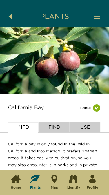
Many of my testers were concerned about the 90% match on the Plant ID matches page – they wanted to know what the other options were and are they poisonous? I added a system of icons to the plants to indicate whether they are edible, toxic, or have poisonous look-alikes. The icons open a pop-up message with details if clicked.
The on-boarding process confused most of my testers, so I made considerable changes to the on-boarding flow, adding a descriptive title and making it optional. Then my preference test resulted in another round of changes to the design of the on-boarding screens.
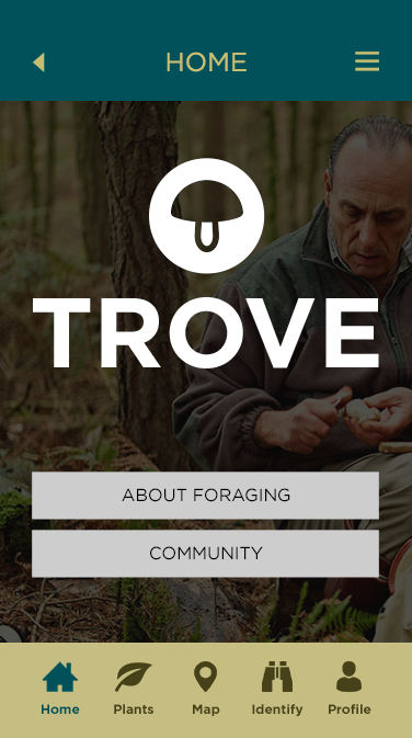
At this point I started to finesse the visual design of the app, including a new logo and color scheme, and making the navigation bar more compact. Finally I analyzed my app for accessibility errors. I added proper labels to to my form fields, and completely reworked the color scheme to increase contrast to AA or AAA levels.