Gym Rat Fitness App

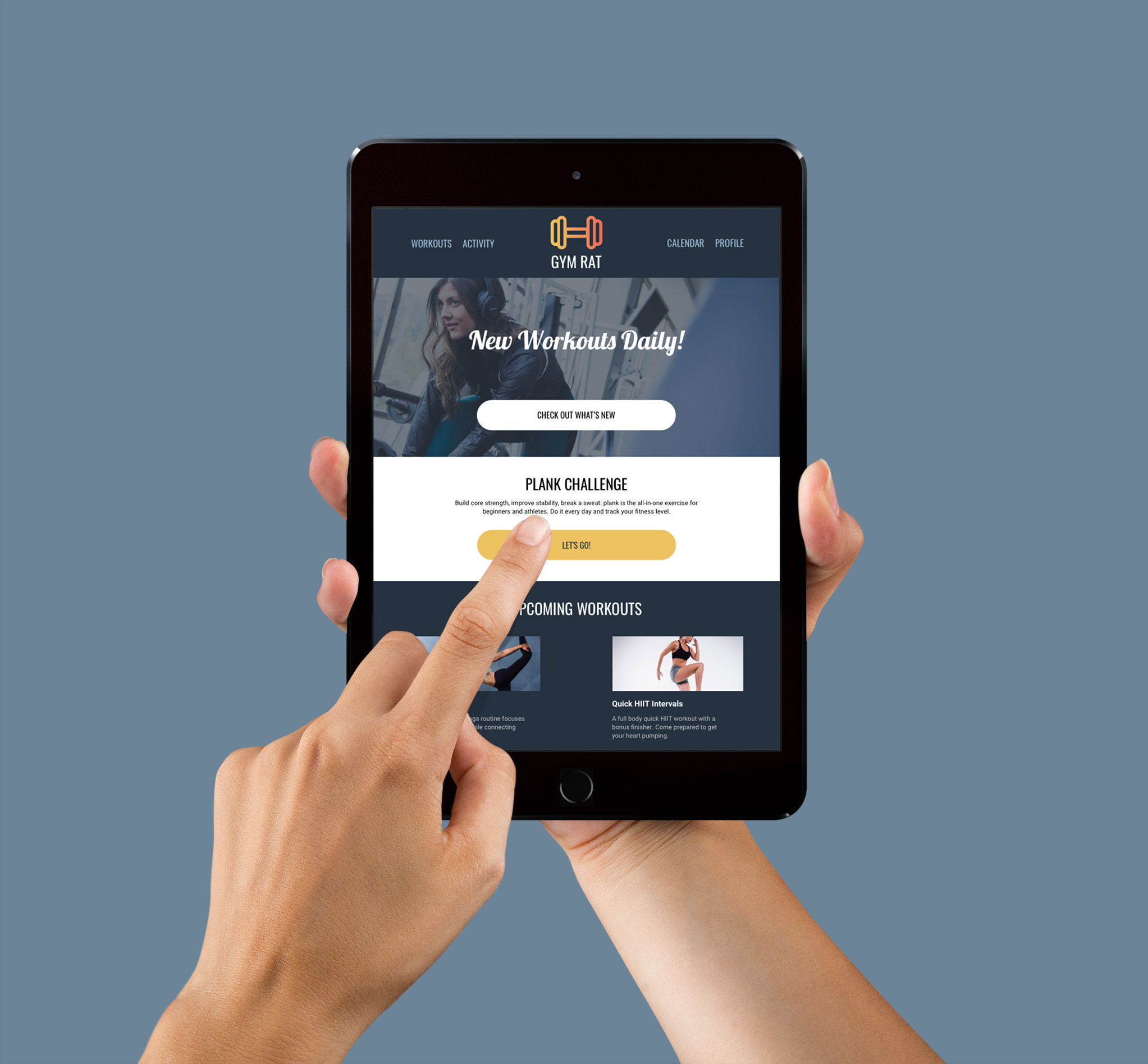
ipad-hands

Overview

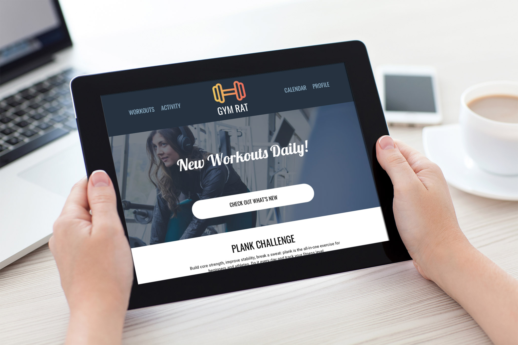
Gym Rat is responsive web app to help people reach their goal of starting a new fitness routine. I was inspired by the potential for using emotional design to help someone commit to a new healthy habit. Click the button below to see the project brief, including objective, persona, user stories, design criteria, and feature requirements.

Role

Visual Design, Grids, Icon Design, Style Guide, Interaction Design, Wireframes, Mockups and Prototypes.

USER FLOW DIAGRAM

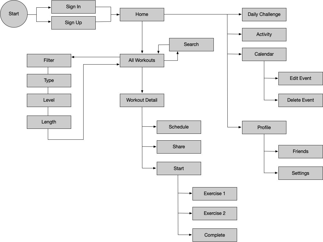
I kicked off the project with some user flows to establish the information architecture.
fitted-flow

LOW-FIDELITY WIREFRAMES

I started with some sketching to generate ideas, then created low-fidelity wirefames using Balsamic Mockups 3.

MOODBOARD

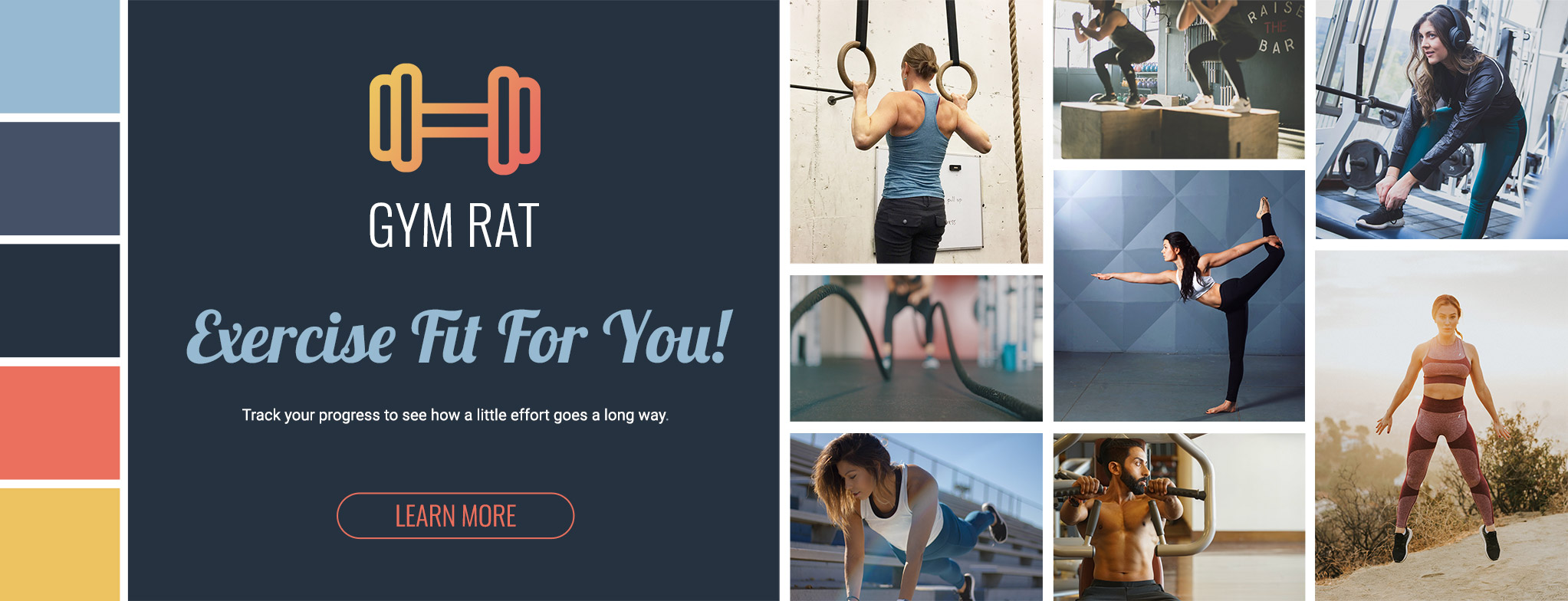
I created this moodboard with the user persona, Rebecca, in mind. The feeling evoked is playful, warm, casual, and quirky. The project brief talks about helping users who are new to exercise find a routine that works for them. The color palette, fonts, and imagery is inviting to people new to exercise. I also like the idea of the app being fun to use, as a way to encourage people to create healthy habits.

Mobile Mockups

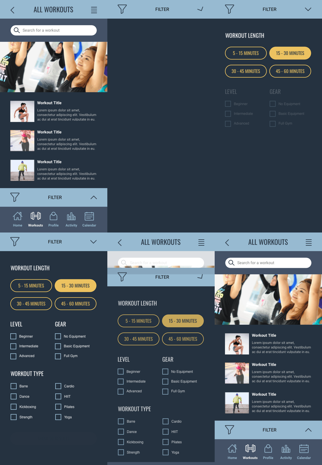
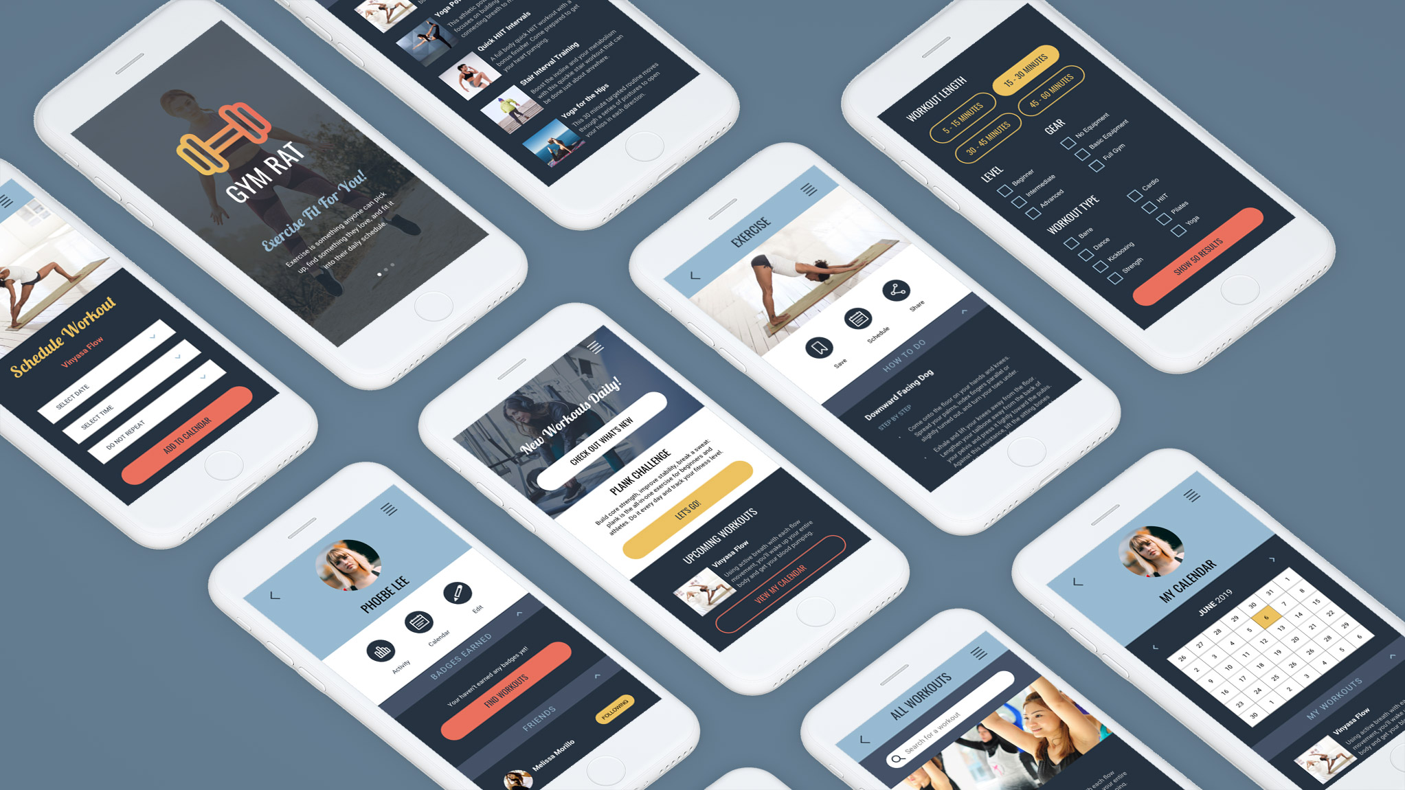
I took a mobile-first approach to this responsive website, starting with was was essential for the mobile experience and then adding complexity for the tablet and desktop breakpoints. A twelve column grid keeps things consistent.

Interaction Animation

filter-animation

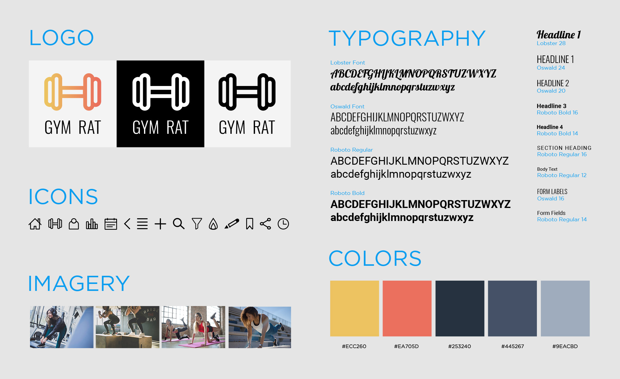
Style Guide

Final Product

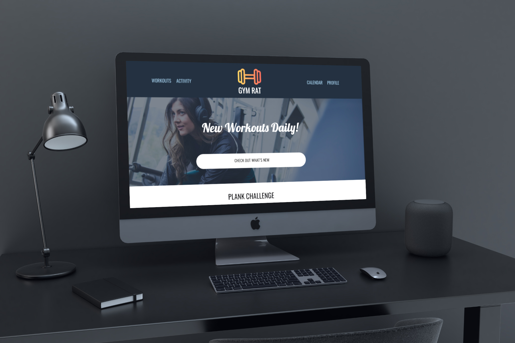
imac-desk-grey
simple-fleet
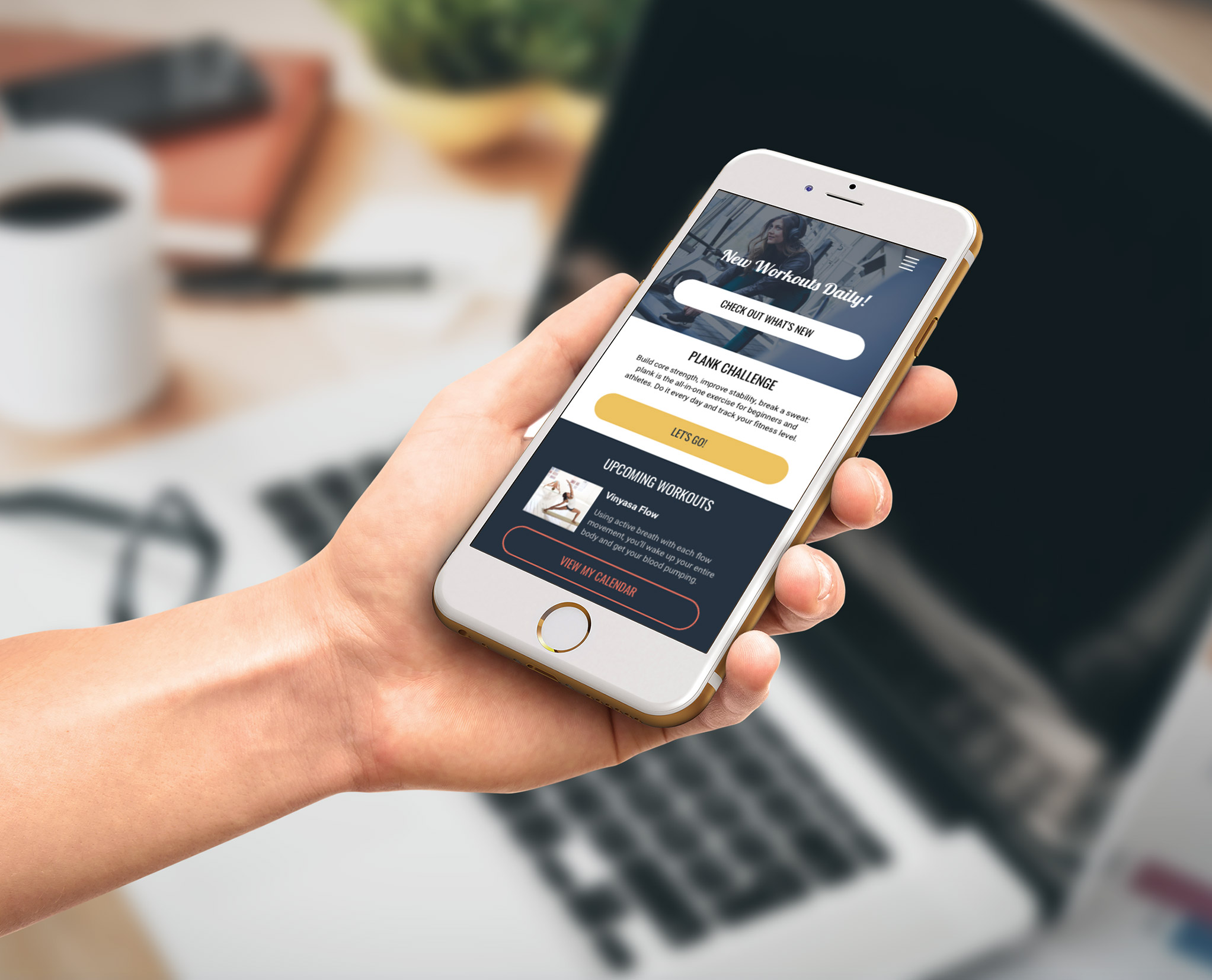
phone-laptop-1
simple-ipad
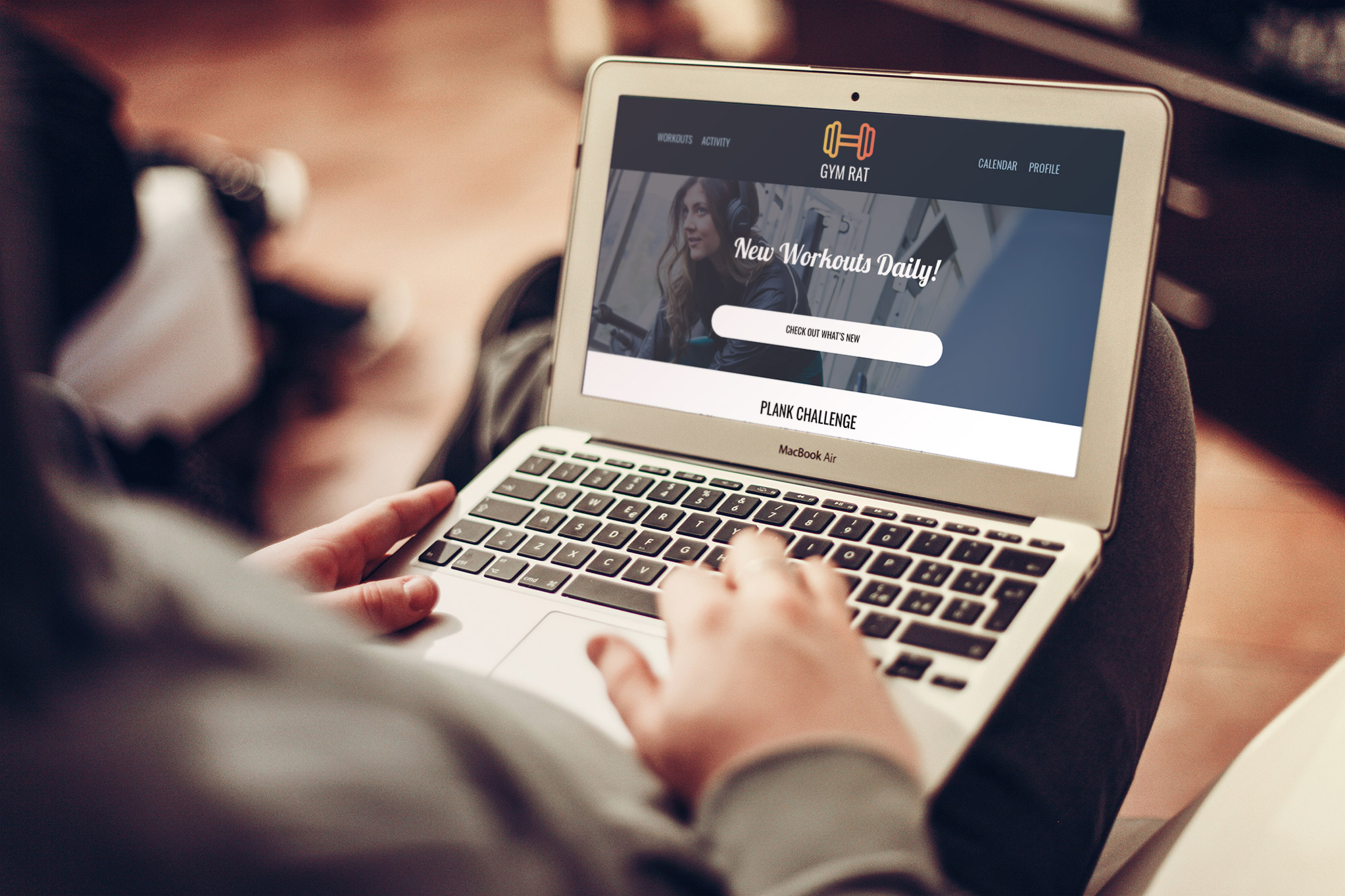
laptop-person

Prototype

To experience the finished prototype, click the button below.

  • Thank you again so much for all of your help getting the images to the website by Wednesday. I passed my orals with flying color in large part thanks to you!  I know i've said it before, but I am absolutely super happy about how the site turned out and couldn't have asked for a nicer and more accommodating person to work with on this. You made it all seem really do-able and that helped so much.

    Amy Chaloupka
  • Laura Shurtleff designed the website and logo for our restaurant, Odd Duck - www.oddduckrestaurant.com.  We love the design and get tons of compliments on it all the time!  It has translated well into all sorts of mediums.  The website is perfect and easy to work with.  Laura is incredibly responsive, super timely, and really great at taking your vision and making it a reality.  I would recommend her work to anyone!

    Melissa Buchholz
  • Laura really took the reins to get new responsive templates working for MotoSport promotional emails. It's a timely next step for our email templates making a better connection with our customers going forward and she didn't hesitate in getting it done well. Both Laura and the rest of the Creative team have taken the first step in making the emails easier to build and maintain going forward.

    Enoch Platas